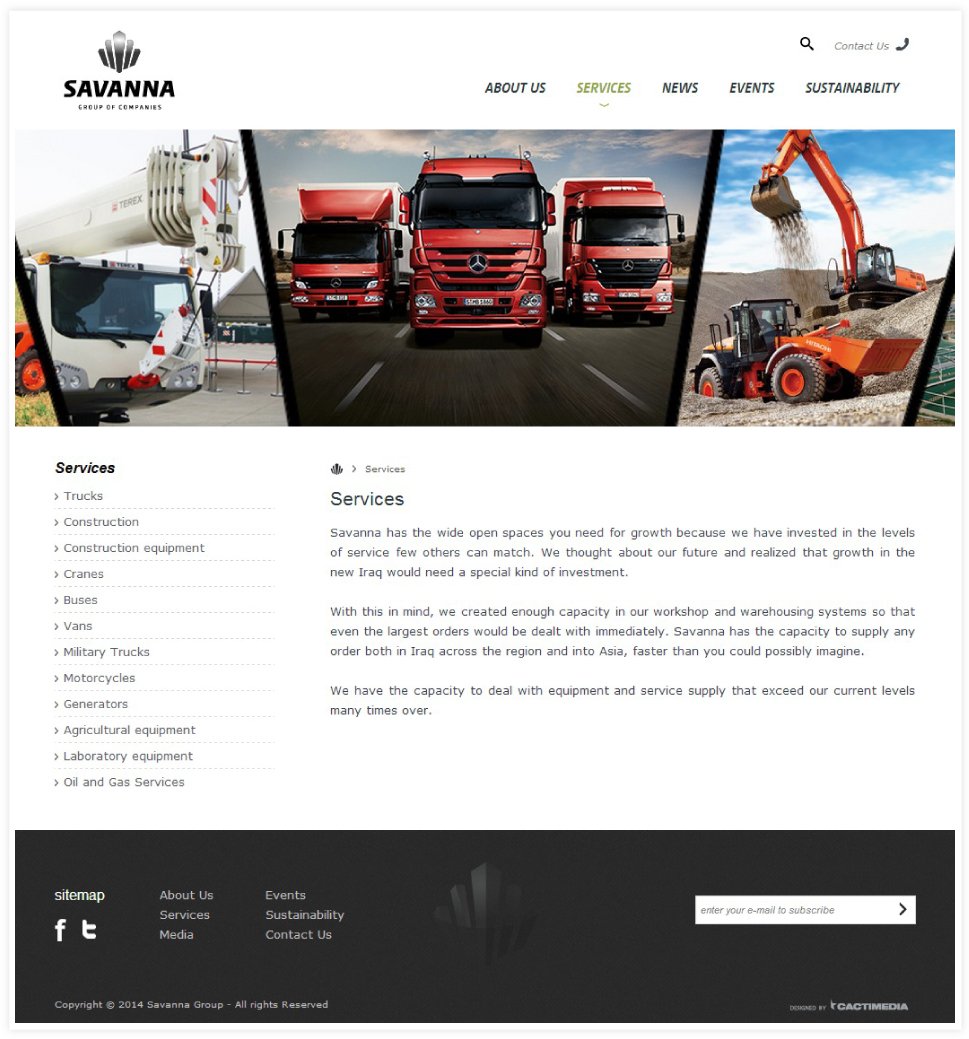
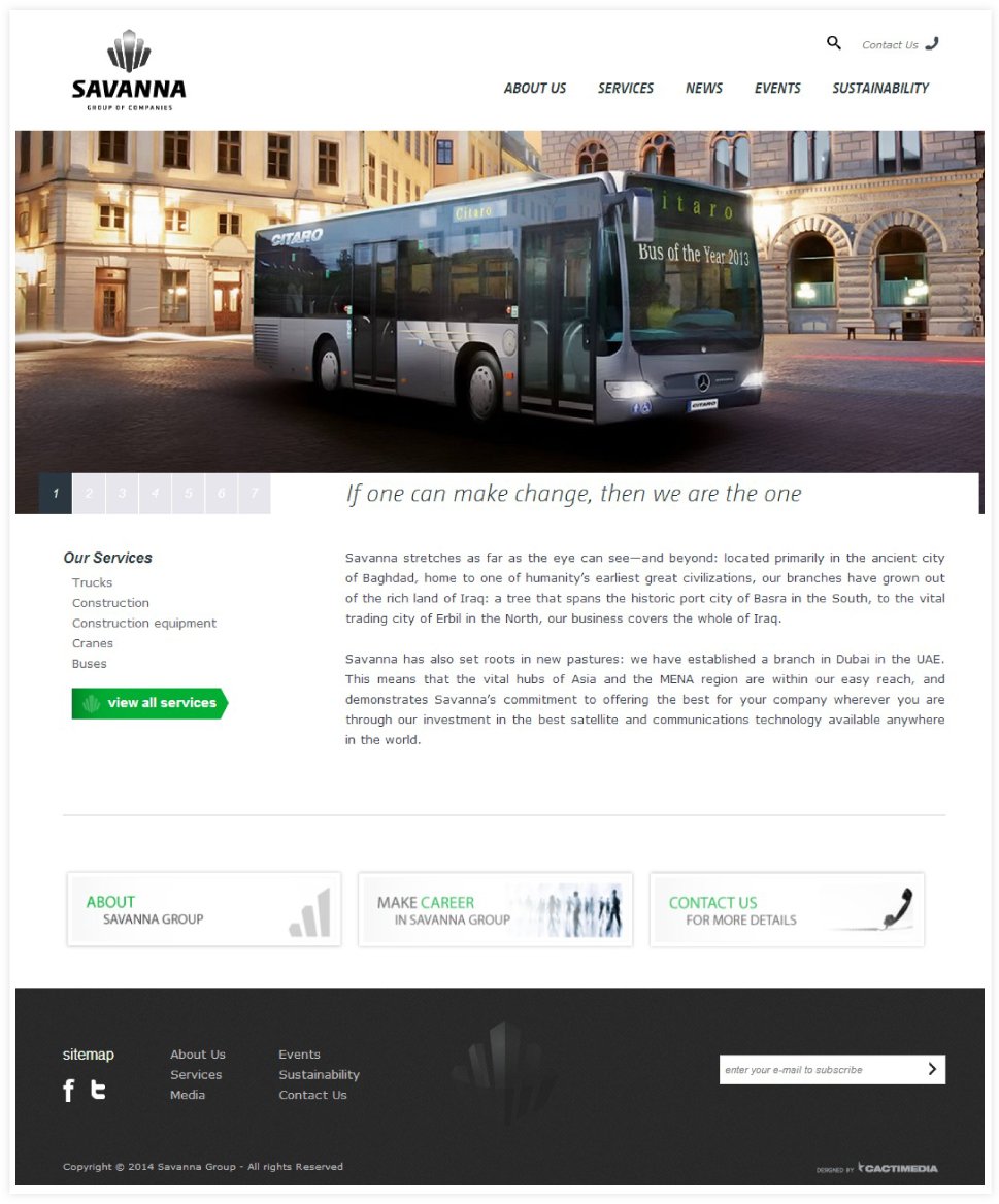
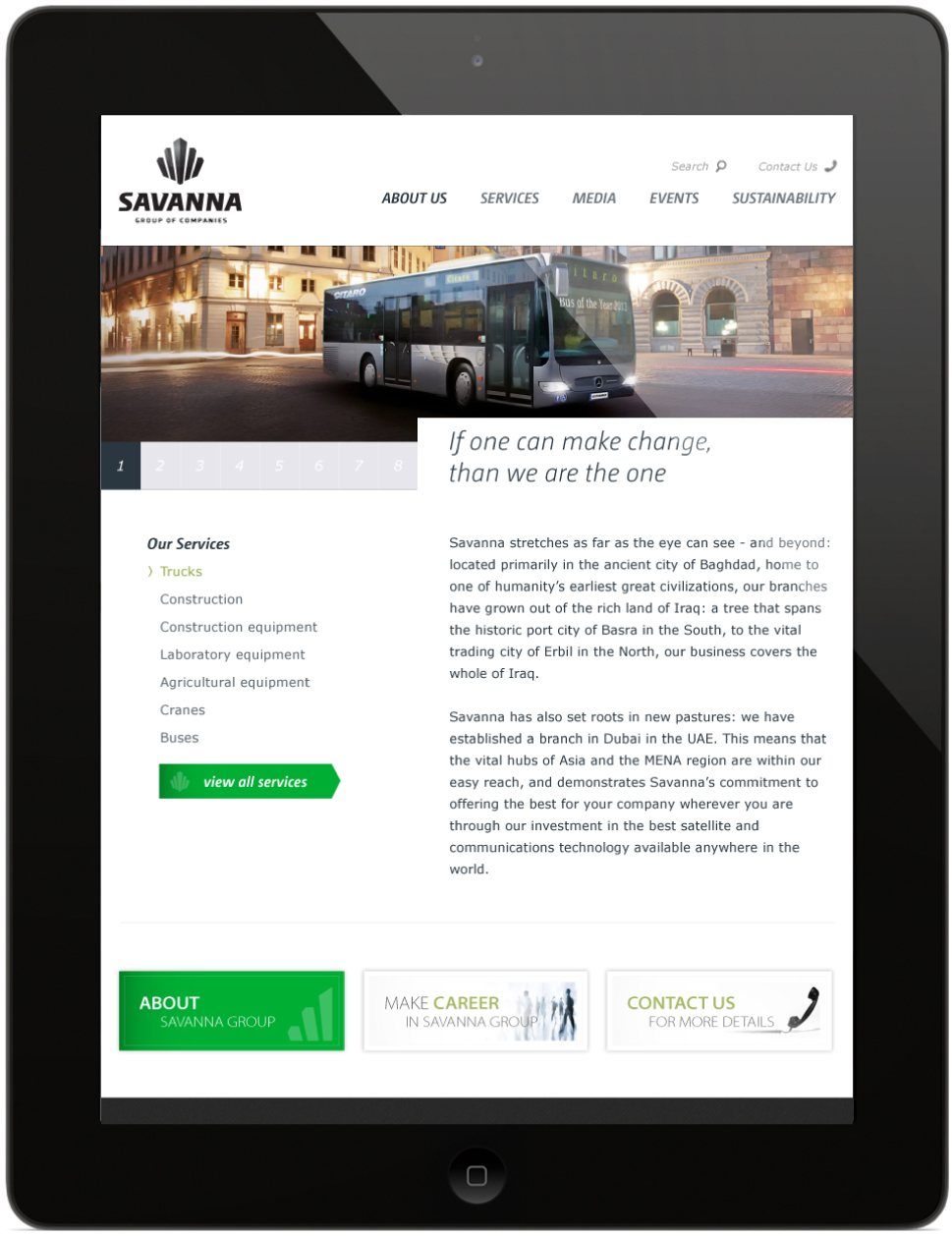
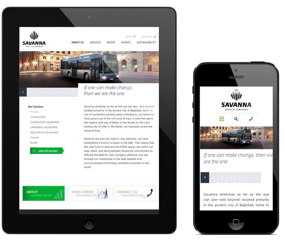
The color combination of black, white and green gives it its professional appeal. The top menu has deliberately been kept to just a few elements so that users can find what they are looking for easily and quickly. The side menu is further meant to provide easy access to Savanna’s top services.
brief
what have we done?
User Experience
Web Design
Web Development
Responsive

Savanna’s website uses carefully selected images in its top slider to communicate its service value and enhance its overall appeal.
Take a peek at the Savanna website here.


