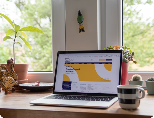
Your customers are online, using all kinds of devices to access your website, from desktops down to handheld devices such as tablets and smartphones.
The question is, “Does your website work flawlessly on every one of them?”
The growing demand for an immaculate web presence across multiple devices has led to the inception of responsive web design. Developers can now make your website so versatile that pages automatically adjust to fit the screen, no matter the device’s size, orientation, or operating system.
As a professional web design and development agency in Dubai, Cactimedia offers comprehensive responsive design services that guarantee to improve digital experiences.
We combine functionality, elegance, and simplicity to equip your brand with a responsive website that will make you more efficient, innovative, and successful. With the help of the latest tech and cutting-edge practices, we can make your website perform better, enhance brand image, and outrank your competitors.
Investing in technologies that allow your site to function optimally across all devices is necessary. Our responsive design practices focus on a user-centered design to ensure we create the best viewing experience for your users. We develop solutions that automatically reformat and resize a page’s layout, content, and images to fit the screen size of a user’s device. This enhances your site’s usability and UX, helping to boost conversions down the line.
At Cactimedia, we focus on result-oriented, innovative design solutions that keep your business at the top of the competition and search engine rankings.
How Cactimedia Creates Responsive Websites
We specialize in designing responsive websites that enhance SEO marketing strategies, create a more unified online presence, and help rank higher in search.
Our responsive website development process begins by understanding the system requirements and defining user personas. The key design elements of your website will determine the strategies for our adaptive product.
Our design experts use flexible images, fluid grids, and media queries so page elements can expand or contract depending upon the width of the screen or browser window. But a responsive design isn’t only about “making everything fit.” Your site needs to adapt to a device’s hardware and web browser capabilities, as well as the device’s resolution.
Our work doesn’t stop after launching a responsive site. We track and monitor your site’s performance to ensure it continues to adapt to various platforms and screen sizes and offer a seamless experience across the board.
Let’s discuss your responsive design needs today.
Build Responsive Design with These Features
- Optimized layouts
- Efficient scaling
- Seamless navigation
- Experienced web designers
- Cost-effective solution
Attract More Customers with Responsive Websites

Being Scalable & Adaptable Across Devices Is Important to Every Business
Consumers today expect perfection. They stop engaging with a website that doesn’t display content properly, simply hitting the back button to find another that does. Not owning a responsive site means losing customers to your competitors and driving down your conversion rate.
A website with a responsive design looks clean, modern, and sleek. It enables you to engage with a larger consumer base and scales your business for growth. It ensures your website is usable by everyone, allowing them to receive a seamless user experience no matter the screen dimension or the operating system, boosting customer satisfaction and trust in your brand.
Responsive Websites Create a Positive Brand Image
Responsive Web Design Can Help You Outrank the Competition

Enhanced Look & Feel
A responsive website automatically adjusts the page layout to fit a range of screen sizes. Images aren’t distorted, and content can be consumed without zooming, shrinking, and pinching the screen. That means users can use your website with ease on any device. This is especially important when people use your site on mobile phones.
When everything looks, feels, and performs perfectly and consistently, people are more likely to return for repeat interactions with your site.

Helps Reduce Overall Cost
A responsive website allows you to optimize your business for all devices with a single website. That means you don’t need to create a different version for desktop and mobile. Plus, you can bypass the maintenance and configuration costs associated with having two separate website versions.
Responsive web design helps reduce the time, resources, and cost of development. And since there’s only one website, developers spend less time on maintenance, helping to lower your overall costs.

Dominate Search Results with Better SEO
Websites without responsive design take more time to load and don’t display content well. This frustrates visitors and causes them to bounce. Google takes note of high bounce rates and poor UX, ranking these websites lower in SERPs.
On the other hand, responsive sites are optimized for smartphones and tablets, so web pages load faster and are easier to use and navigate. Since site performance is better, UX and engagement are high, all of which positively impact SEO efforts.

Reach More Users
A responsive site works on any device, improving the accessibility and usability of your website. More people can now engage and interact with your business.
But a responsive site also looks, feels, and functions properly. By offering better UX, a user’s dwell time significantly increases. Google rewards such websites by placing them higher in SERPs. A higher ranking positions your business in front of more users, driving more traffic to your site.